Hi!
I’ve decided to call my first run of this newsletter, the previous 26 weeks’ worth of A-Z, Season 1. This week is not a typical issue, it’s going to be a recap of those 26 weeks, but with charts! But also, I’m sorry in advance to the 2 colorblind readers that I know have (and the others I don’t know I have), my marker set was not a great tool for providing accessible colors.
Somewhere along the way, I’ve picked up data visualization as a hobby, and love charting my own life, in a bit of a “quantified self” kind of way, like with the pennies that my family and I pick up or my swim routes. So I knew that one of the best way to look back at season 1 would be with visually with charts.
First, let’s look at a few quick stats:
-
Number of issues: 26
-
Total photos: 123 (excludes Instagram embeds, considers “mosaics” a single photo)
-
Averages photos per issue: 4.73
-
Number of subscribers: 43
-
Weeks skipped: 0
It’s a fairly modest setup so far, but I’m happy with it. I think the distribution is small compared to big newsletters, but for this many people to be subscribed to me rambling about the minutiae of my life, is pretty good!
Now let’s get in to the fun stuff: the charts!
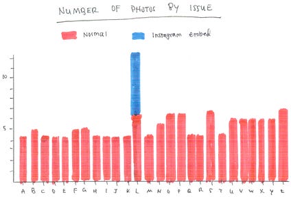 This chart is pretty simple, it’s just the number of photos in each
issue. As noted above, I am considering some of the “mosaic” images
(like the ones in E is for Every Day
or in Y is for Your Pictures) to
be a single photo, for simplicity’s sake. I broke out the Instagram
embeds in L is for Lighthouse
because they were separate photos. I think L also marks the beginning of
an interesting trend: I mostly stuck to 4 pictures per issue before, but
the average definitely seems to have gone up afterwards.
This chart is pretty simple, it’s just the number of photos in each
issue. As noted above, I am considering some of the “mosaic” images
(like the ones in E is for Every Day
or in Y is for Your Pictures) to
be a single photo, for simplicity’s sake. I broke out the Instagram
embeds in L is for Lighthouse
because they were separate photos. I think L also marks the beginning of
an interesting trend: I mostly stuck to 4 pictures per issue before, but
the average definitely seems to have gone up afterwards.
My initial goal with the newsletter was “about 4 pictures per week” since I figured that would be sustainable, but towards the end I worried less and got better at finding pictures to include, I think.
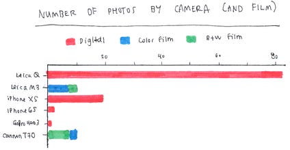 This is a breakdown by device. I try not to focus on the camera used to
take each photo, because a good photo is a good photo, no matter where
it came from.
This is a breakdown by device. I try not to focus on the camera used to
take each photo, because a good photo is a good photo, no matter where
it came from.
-
Clearly, an overwhelming majority of the photos in the newsletter have come from my Leica Q. Part of the reason I created the newsletter was that I wanted a forum to publish those photos since I don’t really post them elsewhere, so that’s somewhat intentional.
-
Another interesting trend is the “opposites” with the two film cameras. I have posted more color photos with the Leica M3, and more Black and White photos with the Cannon T70. I think this is mostly due to recency bias: I started using the M3 more recently, and also only recently started to use color film.
-
The same recency bias applies to the iPhone models. I bought the XS in September 2018, and since more the photos I include are taken more recently, the newer phone is included more.
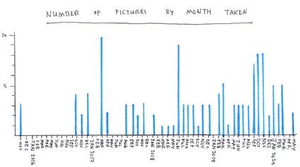 The above distribution is by month the photo was taken. Overall, there’s
a lot of a recency bias. For reference, the first issue of the
newsletter was in November 2019, so all the photos included after that
date were after the newsletter hard started.
The above distribution is by month the photo was taken. Overall, there’s
a lot of a recency bias. For reference, the first issue of the
newsletter was in November 2019, so all the photos included after that
date were after the newsletter hard started.
A few highlights:
-
November 2015: This early group of photos is from Friendsgiving.
-
December 2016: Hawaii, the first time I rented a Leica Q.
-
March-April 2017: Paris! the second time I rented a Leica Q.
-
September 2017: This is when I bought my own Leica Q, so I started using it more, which contributes to the “fuller” bars past that point in time.
-
June 2018: England and Jen and Grant’s wedding.
-
September 2019: Ireland.
-
October 2019: Mandy and Joseph’s wedding.
-
November 2019: I think it was just a social month where I brought my camera a lot, including a lighthouse excursion.
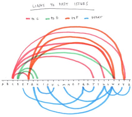 This might be my Pepe Silvia moment. The concept started as an idea
for a “link timeline”. It took a few tries to get a somewhat readable
layout instead of a jumble of multicolor spaghetti. Each arc represents
when I linked from an issue to a past issue. The links are all
unidirectional, since past issues can’t really link to future issues
that don’t exist yet.
This might be my Pepe Silvia moment. The concept started as an idea
for a “link timeline”. It took a few tries to get a somewhat readable
layout instead of a jumble of multicolor spaghetti. Each arc represents
when I linked from an issue to a past issue. The links are all
unidirectional, since past issues can’t really link to future issues
that don’t exist yet.
-
C is for Candid, D is for Dutch Angle, and F is for Focus were popular targets. I think these were some of my favorite photos, and because these issues were early on, there were more future issues that could link back reference them.
-
W is for Weddings clearly linked out the most. I’d used wedding photos in many past issues and linked to all of them from this issue.
I’d had this idea for a summary with hand-drawn charts for a while, and I had to wait until I finished Z to be able to start this. I had a ton of fun putting these together, it’s my own little take on Michelle Rial’s creative watercolor charts. I hope you enjoyed these too!
Next week will be another recap, but a more qualitative one. It’ll have feelings and stuff and some notes about my creative process and some of the tooling I use. Thanks again for sticking around and we’ll see you next week!
XOXO,
Margs